Shopify Color Variant Photos That Match the Product Buyers Select
A consistent backdrop can make Shopify color variants look like one product range, but AI recoloring can make the actual colors unreliable. This guide shows how to build a matched image set from a real photograph of every variant, use Nano Banana Pro for product-free backgrounds, and check each image against its swatch and SKU before publishing.
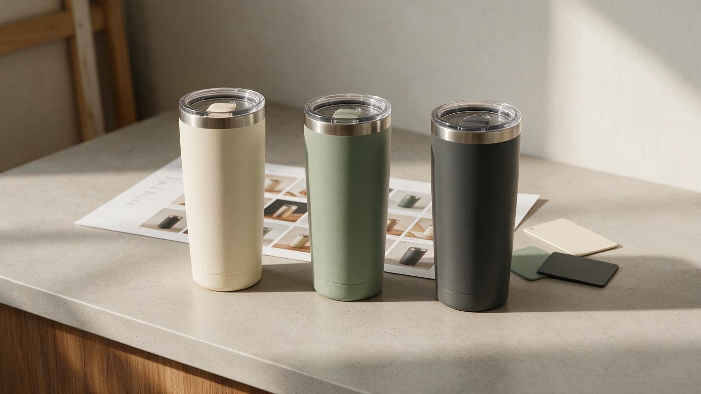
Table of contents
One product range, without misleading color
A shopper selects the sage tumbler, but the gallery still shows the cream one—or the sage image has been AI-recolored into a shade you do not sell. Either mistake makes it harder to trust the variant selector. The reliable approach is to photograph each color you ship, then make the lighting, crop, and background consistent around those photographs. AI can help create the setting; it should not become the evidence for the product’s color.
This approach works especially well for Shopify stores with several colorways photographed on different days. It is also useful for marketplace listings where buyers need to distinguish similar shades at a glance.
Start with a real photograph of every sellable color
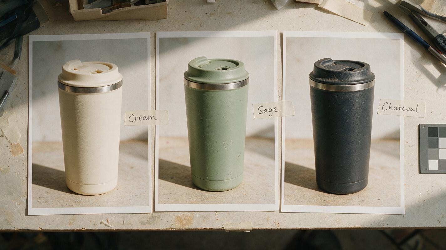
For a three-color tumbler, collect three source photographs—not one photograph and a request to make two more colors. Shoot each physical variant from the same angle, at approximately the same camera distance, with the lid and any logo facing the same way. Use even, neutral light and keep a color reference in a separate working shot when accurate shade matching matters.
Make a simple source sheet before editing:
| Variant | Source photograph | Details to preserve |
|---|---|---|
| Cream | Front three-quarter view of the cream unit | Lid color, logo position, matte finish |
| Sage | Same view of the sage unit | Green undertone, lid color, matte finish |
| Charcoal | Same view of the charcoal unit | Dark-edge visibility, logo contrast, matte finish |
Confirm that the photographed units match the variants currently for sale. If a lid, logo, or finish changed between batches, do not use an older photo merely because its angle matches the set. A consistent gallery is valuable only if each image still represents what the buyer will receive.
Generate one setting that works across the whole range
Use Nano Banana Pro to explore a background, not to reconstruct the tumbler. With an ai image generator, request an empty scene that leaves room for the photographed product. A pale neutral setting often accommodates both light and dark variants more predictably than a strongly colored surface.
For example, generate a square lifestyle backdrop with an empty central placement area. Keep the camera viewpoint and lighting direction compatible with your source photographs:
Photorealistic ecommerce lifestyle background only. A clean, warm-neutral kitchen counter beside a softly lit wall, viewed from a front three-quarter product-photography angle. Diffuse daylight enters from the left. Leave the center of the counter empty and unobstructed for a separately photographed insulated tumbler. Subtle surface texture, restrained props at the far edges, realistic contact area. No tumbler, cup, bottle, logo, lettering, hands, or packaging.Choose one background and reuse it across the color set. Generating a different kitchen for every variant may look attractive individually, but it introduces lighting and context changes that make side-by-side color comparison harder. If the output includes a stray cup or implausible surface, revise the empty scene rather than painting over the problem behind your product.
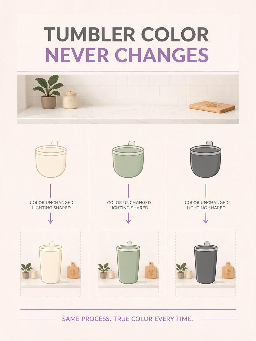
Keep the product pixels authoritative. The generated scene can supply atmosphere; the photograph of the actual variant supplies its shape, surface, label, and color.
Composite the variants without shifting their shades
Place each photographed tumbler onto a copy of the same background canvas. Align them to the same baseline and keep their displayed heights consistent, allowing only for genuine differences between variants. Match the source lighting to the scene with restrained adjustments to exposure and shadow. Do not apply a global warm or cool filter to the finished composite: it can shift sage toward olive, cream toward yellow, and charcoal toward blue.
A contact shadow should make the tumbler appear grounded without changing the photographed edge. If a pale tumbler blends into the counter, adjust the background contrast near the product rather than drawing a heavy outline around it. If the charcoal version loses detail, inspect the source exposure first; brightening the entire product can misrepresent its finish.
Keep the original product photographs available beside your working files. Compare each finished image against its own source, not just against the other composites. When in doubt about a shade, check the physical item under neutral light as well. A screen preview cannot establish an exact color match on its own.
Connect each image to the correct Shopify variant
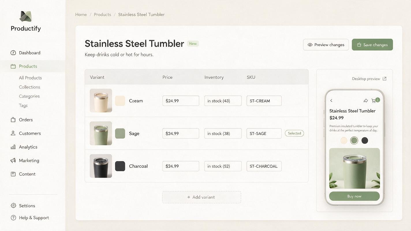
A visually accurate image can still mislead if the storefront displays it for the wrong selection. Name exports with the product and variant identifier—for example, tumbler-sage-lifestyle.jpg—then assign each image to the corresponding Shopify variant. Preview the published product page, rather than relying only on the media editor.
Test the selector as a shopper would: choose cream, sage, and charcoal in turn and check the image that appears first. Inspect the page on mobile as well as desktop. If your theme keeps a shared gallery visible, make the variant names or image ordering clear enough that a shopper will not confuse one color with another. Your theme’s behavior may differ, so verify the live presentation rather than assuming an uploaded variant image will automatically become the first visible photo.
Use supporting images for questions the coordinated hero set cannot answer: a close-up of the actual finish, a lid detail, or a photograph showing the physical variants together. These should remain real product evidence, not AI-generated substitutes.
Final checklist
- Every sellable color has its own photograph of the actual product.
- Product angle, crop, scale, and background are consistent across variants.
- No generated color, logo, lid, or finish has replaced a photographed detail.
- Each exported image is assigned to the correct Shopify variant.
- The live selector and gallery have been checked on desktop and mobile.
Once the source photographs are ready, try these models for free to develop an empty setting, then compare every finished composite with the physical variant before it goes live.
Keywords
Shopify color variant photos, product listing images, AI product photography, product photo background, Shopify product images, Nano Banana Pro