Why Your Shopify Mobile Banner Crops the Product—and What to Change
A desktop Shopify hero can look polished while the mobile version cuts off the product or leaves the headline unreadable. This guide shows sellers how to plan separate crops, generate useful background space with Seedream 4.5, and check the finished banner in their actual theme.
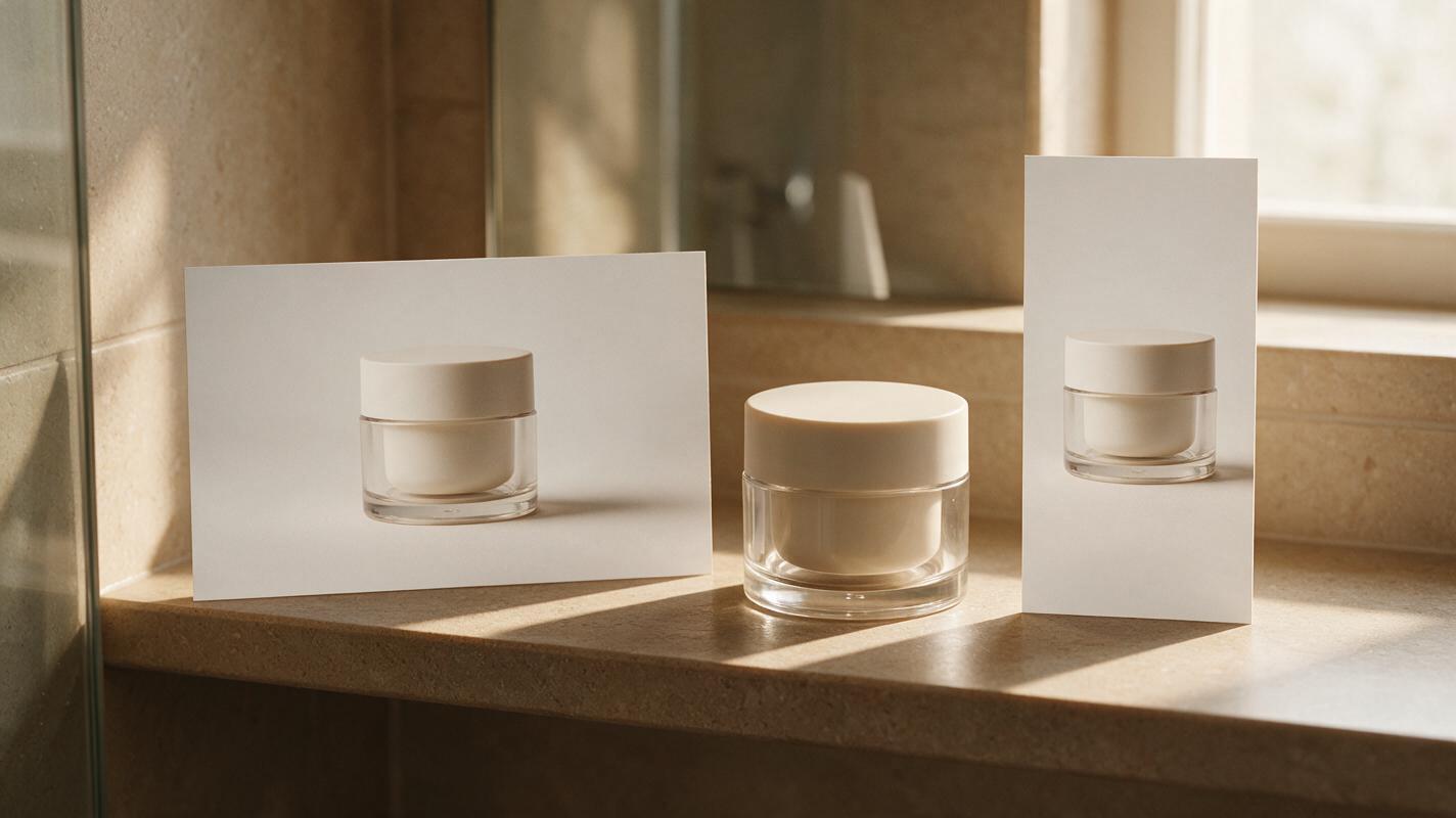
Table of contents
When the desktop banner works but mobile cuts off the product
Your Shopify hero may show a complete product beside a clear headline on desktop, then crop the product in half on a phone. The fix is not simply to upload a larger image. You need a composition that survives the mobile crop—or a separate mobile image when your theme supports one.
AI can help create a setting with room around your product, but it cannot predict every theme’s crop. Keep the photographed product intact, place headlines as editable page text where possible, and judge the result in your storefront preview.
Find the crop your theme actually uses
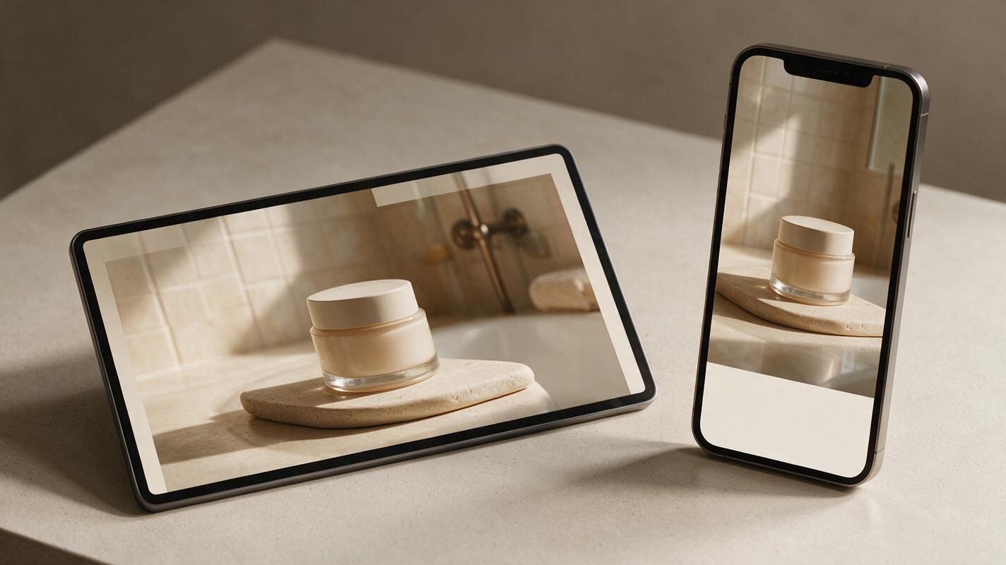
A banner is displayed inside a container whose shape changes with the screen. If the theme fills that container by cropping the image, its outer edges may disappear. The amount removed depends on the section settings, image dimensions, text placement, and device width.
Open your theme editor and preview the same hero at desktop and mobile widths. Note where the product sits, which edges disappear, and whether the headline or button overlaps it. Check the published page on a phone too: an editor preview is useful, but the live layout is the final test.
Do not design to an assumed universal “safe zone.” Use a draft banner in your own theme to identify the space that remains visible.
Choose a layout that gives the product room
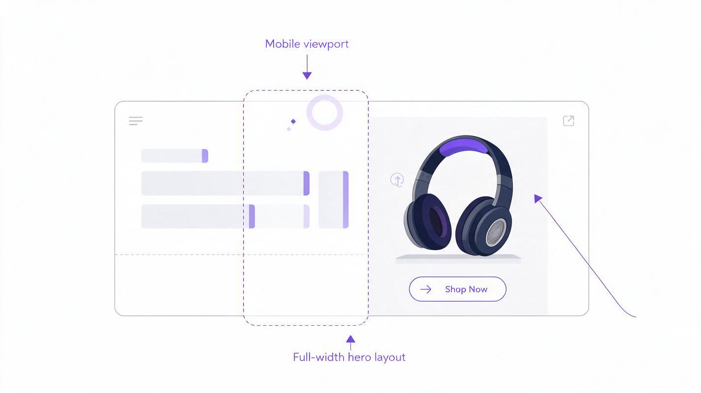
For a wide desktop hero, a product on one side and copy on the other can work well. On a narrow screen, that same side-by-side arrangement often fails: centering the crop may remove the product, while shifting it toward the product may remove the intended copy space.
| Layout choice | Best when | What to check on mobile |
|---|---|---|
| One image for both screens | The product and essential scene fit near the center | Can the theme crop without cutting the product? |
| Separate desktop and mobile images | Your theme accepts a distinct mobile banner | Do both images show the same sellable product accurately? |
| Product image plus theme-controlled text | You need a headline or button in the hero | Does the text remain readable without covering the product? |
If your theme only accepts one image, favor a simpler, more central composition. If it accepts separate images, create two intentional layouts rather than relying on an automatic crop of the desktop file.
Generate space around a real product photograph
Start with a sharp photograph of the item you sell. Preserve its shape, color, label, and packaging. For a lifestyle setting, you can use Seedream 4.5 through an ai image generator to develop an empty background, then place your verified product photograph into the composition. This is safer than asking a model to redraw a labeled jar, patterned bag, or other detail-sensitive product.
Make a desktop scene with a clear product area and a separate mobile scene with more space above or beside the product, depending on where your theme puts its text. A reusable background prompt:
Photorealistic ecommerce hero background for a small skincare jar. Warm neutral bathroom shelf, soft natural window light, restrained shadows. Leave the center foreground empty for a photographed product; leave uncluttered space in the upper portion for website text. No jar, packaging, lettering, logos, hands, or extra products. Clean surfaces and believable perspective.Change the setting to suit your category, but keep the instruction to leave the product area empty. After placing the real product photo, match its camera angle, lighting direction, contact shadow, and apparent scale to the scene. If the match looks forced, simplify the background or photograph a new base image rather than altering the product’s defining details.
Make the mobile version a composition, not a smaller desktop file
For the mobile layout, move the scene around the product rather than squeezing everything into a narrow crop. The product should remain fully visible at the size shoppers will see. Leave enough quiet background for theme-controlled text if your hero contains a headline or button.
Keep important copy out of the generated image. Editable website text is easier to update, generally scales more predictably across screens, and avoids AI-generated lettering errors. If your theme places text over the image, test its alignment and contrast before deciding where the product belongs.
Use this mobile-background variation when the desktop scene has too much detail at the sides:
Photorealistic portrait ecommerce hero background matching a warm neutral bathroom shelf. Simple wall and shelf, soft natural light from the left. Leave the lower-center foreground empty for one photographed skincare jar, with generous uncluttered space above it for website headline text. No product, packaging, typography, logos, or decorative objects that could be mistaken for items included with purchase.These prompts describe example settings, not guaranteed dimensions or safe zones. The correct product position is the one that works in your theme preview.
Inspect the banner where shoppers will see it
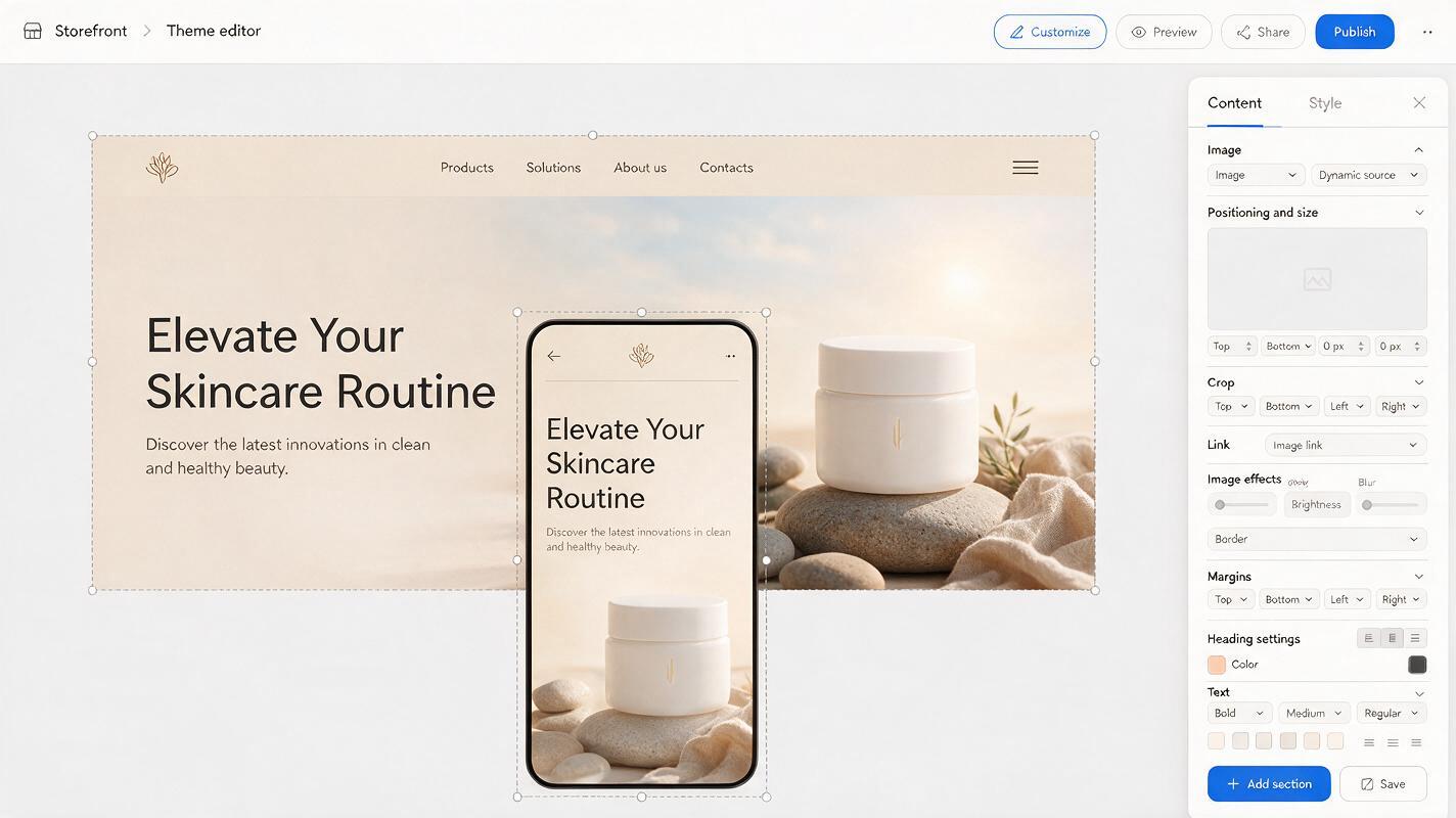
Upload the desktop and mobile versions if your theme allows both. If it does not, upload the single-image composition that performed best across screen sizes. Then inspect a large desktop window, a narrow desktop window, and at least two phone widths.
- Product: Are its silhouette, label, color, and edges intact and visible?
- Crop: Does any common screen width remove a feature shoppers need to see?
- Text: Is the headline readable, and does the button avoid covering the item?
- Scene: Do shadows and perspective make the photographed product look grounded?
- Accuracy: Could a prop, generated reflection, or altered label misrepresent what ships?
When a crop fails, adjust the layout rather than repeatedly enlarging the canvas. Try moving the product inward, reducing background detail, changing the theme’s image-height setting, or using a dedicated mobile image. Save the working preview before publishing so you can compare later edits against it.
Final checklist
- Use a photograph of the actual product for its sellable details.
- Determine the real crop in your Shopify theme before finalizing the composition.
- Design a distinct mobile layout when the desktop arrangement cannot survive a narrow screen.
- Keep headlines editable when possible and check them against the product at phone widths.
- Review the live page before treating the banner as finished.
Have a product photo ready? test this prompt yourself, then place the result in your theme and keep only the layout that passes the mobile crop check.
Keywords
shopify mobile banner, shopify hero image, product photo crop, mobile product banner, ai product photography, seedream 4.5