Turn Square Cover Art Into Vertical Promo Posters With Seedream 4.5
Learn how to expand square album artwork into polished 9:16 promotional posters with Seedream 4.5 without stretching the artist, rebuilding the composition, or damaging typography. This practical workflow covers layout planning, outpainting prompts, identity protection, text restoration, and export checks for music campaigns.
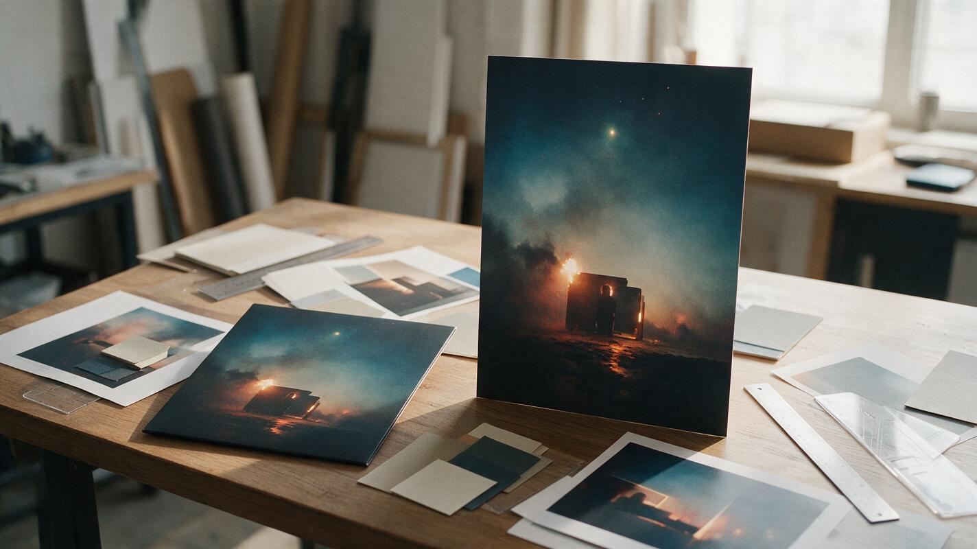
Table of contents
Make one cover work beyond the square
A square album cover rarely fits a vertical release campaign without awkward cropping, empty space, or a stretched artist portrait.
Seedream 4.5 offers a more useful alternative: keep the approved cover composition intact and generate new scenery around it for a 9:16 poster. The goal is not to redesign the artwork. It is to extend its visual world while preserving the artist, color palette, lighting, and recognizable campaign identity.
This approach works for release announcements, Story posts, tour screens, pre-save graphics, lyric teasers, and vertical thumbnails. It is especially effective when the source cover already contains an environment that can continue naturally beyond the square frame.
The central rule: treat the original cover as locked artwork. Generate around it, not over it.
Build a vertical layout before generating
Start with a 9:16 canvas at the resolution required by your destination. Place the square cover inside it without stretching or trimming the approved artwork. Its position determines where the generated extension must appear.
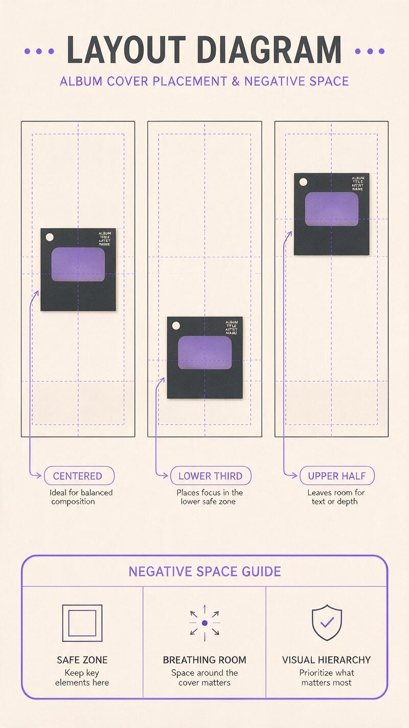
Three layouts cover most music campaigns:
| Layout | Best for | Space created |
|---|---|---|
| Square centered | Balanced release announcements | Room above and below for dates and credits |
| Square in the lower third | Artist name or headline above | A large atmospheric title area |
| Square in the upper half | Pre-save buttons and event details | A clean lower information panel |
Use temporary guides to reserve a safe area for text. Do not ask the model to invent important release information inside the image. Dates, track titles, label marks, and platform logos should be added later as editable design layers.
If the original artwork contains a face, keep it away from the new canvas boundary when possible. A boundary cutting through hair, hands, jewelry, or clothing gives the model more opportunities to alter identity and anatomy.
Extend the scene without redesigning the cover
Upload the prepared canvas to Seedream 4.5 as an image-editing reference. The transparent or blank areas are the regions that need new visual information. Describe the continuation of the existing scene rather than repeating every detail already visible in the cover.
A strong outpainting prompt identifies four things:
- What must remain unchanged: the square cover, artist, pose, clothing, and central composition.
- What should continue: background architecture, fog, studio backdrop, sky, floor, fabric, or light.
- Where space is needed: above, below, or around the cover for campaign copy.
- What must not appear: extra people, duplicate limbs, lettering, logos, or unrelated props.
Use this adaptable prompt for a photographic cover:
Expand this square album cover into a vertical 9:16 promotional poster. Keep the original square artwork unchanged, including the artist's face, pose, wardrobe, framing, color grade, and lighting direction. Continue the existing environment naturally above and below the cover with matching perspective, realistic texture, subtle atmospheric depth, and consistent film grain. Leave calm negative space in the upper third for an artist name and release date. Do not add text, logos, extra people, duplicate body parts, new accessories, or a second face.For graphic or illustrated artwork, replace photographic terms such as realistic texture and film grain with the actual visual language of the source: screen-printed texture, painted brushwork, paper collage, halftone dots, ink grain, or flat vector shapes.
When using an ai image generator for this task, make several restrained variations before requesting dramatic new scenery. The most usable result is usually the one that feels like the original art director simply revealed more of the set.
Prompt variations for common cover styles
Minimal studio portrait:
Continue the seamless studio backdrop vertically with the same soft gradient, shadow density, lens character, and muted color palette. Preserve the original portrait exactly. Create uncluttered negative space above the subject and a subtle floor continuation below.Night-city cover:
Extend the nighttime street upward and downward with matching neon reflections, wet pavement, distant practical lights, perspective, haze, and cinematic contrast. Keep the central cover untouched and avoid readable signs or invented lettering.Surreal illustrated cover:
Expand the composition vertically using the same hand-painted forms, limited palette, edge treatment, paper texture, and dreamlike scale. Continue existing motifs without introducing a new focal character. Keep the middle square composition unchanged.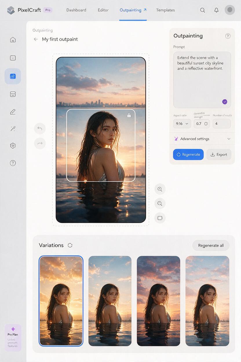
Protect typography, logos, and faces
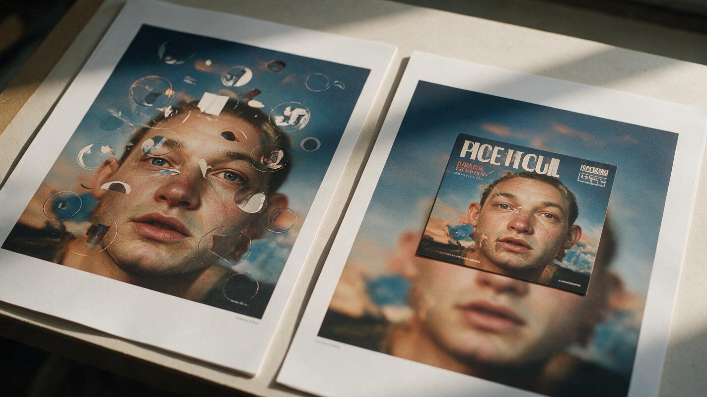
Album-cover typography is vulnerable during generative editing. Even when the overall design looks convincing, letterforms can become misspelled, asymmetrical, or partially replaced. The safest workflow is to preserve the original square as a separate top layer and use the generated result only as the extended background.
After generation, place the untouched source cover back over the center of the vertical image. This simple composite restores the approved face, artwork, logo, and title with pixel-level accuracy while retaining the new surroundings.
Inspect the seam at 100 percent magnification. Look for sudden changes in grain, lighting, horizon height, fabric texture, and color temperature. A soft mask can blend environmental edges, but do not feather across important facial details or original lettering.
If the model altered the artist outside the square boundary, reduce the amount of visible body extension. A crop that ends around the shoulders is often safer than asking the model to invent a full torso, hands, and accessories.
If a generated version has the best background but the worst face, keep the background and restore the entire original portrait. There is no creative benefit in accepting identity drift.
Generate space for campaign copy
Negative space should be intentional, not merely empty. It needs enough visual calm for text to remain readable on a phone while still belonging to the cover’s atmosphere.
Tell the model where the copy will go and what kind of texture should sit behind it. Useful phrases include:
- calm negative space with low visual detail
- dark tonal area suitable for light typography
- soft atmospheric gradient without focal objects
- uncluttered upper third with consistent background texture
- subtle vignette around the future headline area
Avoid requesting a blank white panel unless that geometry already suits the artwork. A sudden empty rectangle can make the poster look like a template rather than an extension of the original campaign.
Once the background is approved, add the artist name, track title, release date, call to action, and label information in a design editor. Reuse the typeface, spacing system, and alignment established by the cover. If the original title is expressive, keep the supporting information quieter so the hierarchy remains clear.
Fix the most common outpainting failures
| Problem | Likely cause | Practical fix |
|---|---|---|
| The extension looks like a different location | The prompt describes a new scene instead of a continuation | Name the existing surfaces, perspective, light direction, and palette |
| The artist’s face changes | The model is regenerating protected pixels | Restore the original cover as a top layer and mask only the background |
| Hands or jewelry duplicate | The generation boundary crosses detailed anatomy | Move the square or crop before the hands enter the extended area |
| The poster has fake text | The prompt requests signs, titles, or release copy | Request no lettering and add all text manually afterward |
| The seam remains visible | Texture, grain, or color differs across the boundary | Match grain and color globally, then blend environmental edges |
| The layout feels top-heavy | New objects compete with the original focal point | Regenerate with fewer objects and quieter negative space |
Change one variable at a time when troubleshooting. If you rewrite the setting, lighting, palette, composition, and texture in a single attempt, it becomes difficult to identify why a generation improved or failed.
Prepare platform-ready exports
Before exporting, view the poster at phone size. Fine textures and delicate type that look elegant on a large monitor may disappear in a social feed. Check that the artist, title, and release message are understandable within a second.
Keep a clean master with editable typography and separate layers for the original cover, generated extension, color treatment, grain, and campaign copy. From that master, create alternate crops for Stories, vertical feed posts, event screens, and streaming-platform announcements without generating the artwork again.
Also export a text-free vertical background. It can support lyric cards, countdown posts, motion graphics, and localized campaign versions. If the release later needs animation, this clean composition provides a controlled starting frame without baked-in text.
When the layout is ready, create your own version and compare at least three restrained extensions before committing to the final campaign background.
Final checklist
- The original square cover remains unstretched and fully recognizable.
- The artist’s face, pose, wardrobe, and defining details match the approved artwork.
- The generated extension follows the original perspective and lighting direction.
- No fake lettering, duplicate limbs, or unrelated objects appear.
- The poster includes calm space for real campaign copy.
- Original typography and logos were restored as separate layers.
- The central seam was inspected at full resolution.
- The final design remains readable at phone size.
- A layered master and a text-free background were saved.
Keywords
vertical album poster, Seedream 4.5, album cover outpainting, music promo design, cover art, AI image editing, artist promo poster