Turn Hand-Drawn Storyboard Sketches Into Cinematic Frames With PixVerse
Rough hand-drawn storyboard thumbnails are fast to create but too unpolished for client pitches and production meetings. This guide shows filmmakers how to use PixVerse’s image-to-image generation to turn loose sketches into cinematically accurate, photorealistic storyboard frames while preserving original shot composition and blocking. It includes prompt templates, composition strength settings, and fixes for common artifacts like sketch bleed and character distortion.
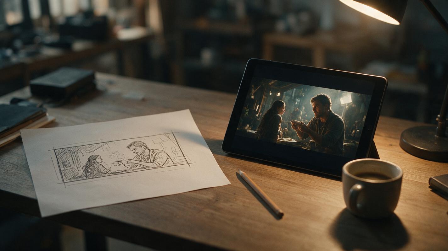
Table of contents
Why hand-drawn sketches need a cinematic polish for pitches
If your hand-drawn storyboard thumbnails are too rough for client pitches but redrawing them digitally takes half a day, this PixVerse workflow turns loose sketches into cinematically accurate frames in minutes.
Thumbnail sketches are the fastest way to work out shot composition, blocking, and camera angles during pre-production. You can dash off 10 frames in 15 minutes to test different coverage options, but those stick-figure drawings and rough shapes rarely sell your cinematic vision to producers, clients, or even your DP.
Redrawing sketches into polished concept art or photorealistic frames takes hours per shot in Procreate or Photoshop, and hiring a storyboard artist to refine them is out of budget for most indie short film projects. This ai storyboard workflow relies on PixVerse’s image-to-image generation to preserve your exact shot design while rendering it as a photorealistic, film-like frame—without redrawing a single line.
Prepare your sketch for maximum composition retention
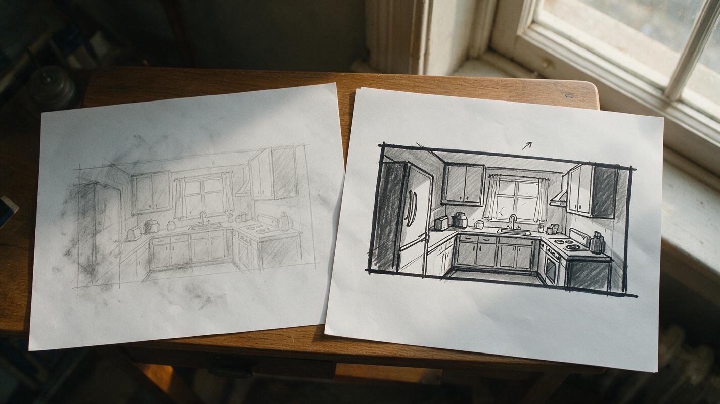
The quality of your input sketch determines how well PixVerse preserves your original composition. You don’t need a detailed drawing—even the roughest thumbnail works if it follows a few simple rules.
- Use a plain white background and thick, dark (black or dark blue) lines for key elements like characters, props, walls, and horizon lines. Avoid smudges or faint pencil marks that the model might misinterpret.
- Crop your sketch to your target aspect ratio (2.39:1 for scope, 16:9 for flat) before uploading. This prevents the AI from adding empty space or cropping out important framing details.
- Mark light direction with a small arrow if you have a specific lighting setup in mind—this gives the model a clear cue for shadow placement, even if the rest of the sketch is rough.
- Label critical props or set pieces only if they’re unrecognizable in the sketch; the model usually picks up basic shapes like tables, windows, or doors without labels.
For example, a thumbnail for a diner scene only needs a rough rectangle for the counter, two stick figures on stools, a window on the back wall, and a line for the horizon. That’s enough for the model to understand the spatial layout.
Set up PixVerse image-to-image with composition control
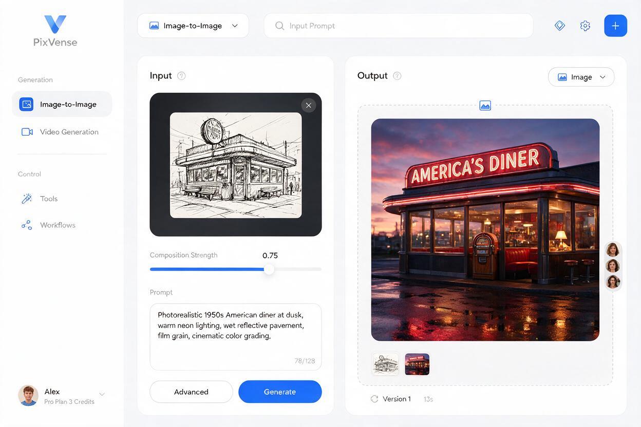
PixVerse’s image-to-image mode includes a composition strength slider that’s the key to keeping your original shot design intact. This slider controls how closely the output matches your input sketch’s layout, versus how much creative freedom the model has.
For most storyboard sketches, start with a composition strength of 0.75. This preserves your blocking, camera angle, and framing while rendering the scene as a photorealistic image, without leaving sketch lines visible.
Use this base prompt structure to get consistent cinematic results, swapping in your own scene details:
[SHOT TYPE] of [CHARACTER DESCRIPTION] [ACTION] in [SETTING], [LIGHTING DETAILS], [LENS/FILM STOCK], cinematic composition, [ASPECT RATIO] aspect ratioFor the diner scene example, the full prompt would look like this:
Wide shot of a tired middle-aged waiter wiping down a Formica diner counter at 2am, neon sign glow reflecting in the front window, dim overhead fluorescent lights, deep shadows, 35mm film, Kodak Vision3 500T, grainy, cinematic composition, 2.39:1 aspect ratioPair it with a negative prompt to filter out common artifacts:
sketch lines, drawing, cartoon, anime, distorted anatomy, blurry, text, watermark, extra limbs, flat lighting, overexposedTest this prompt yourself with your own rough sketch to see how much detail the model can add while preserving your original shot design.
Refine prompts for sequence continuity and mood
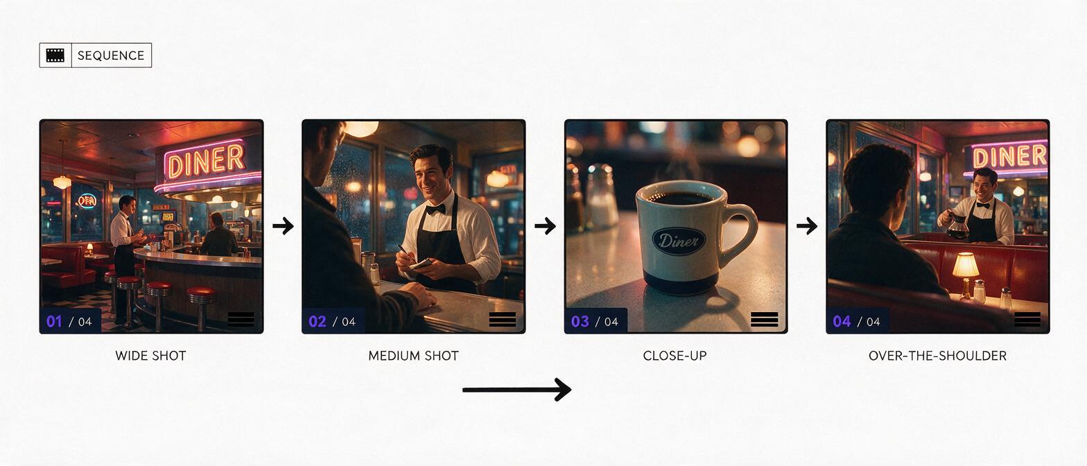
If you’re working on a multi-shot storyboard sequence, consistency across frames is critical. You don’t want the diner to look like a different restaurant in every shot, or the waiter’s hair color to change between a wide shot and a close-up.
Keep a shared base prompt for every frame in the sequence that includes:
- Setting details (diner, Formica counter, neon sign in window)
- Lighting setup (2am, neon glow, dim fluorescent, deep shadows)
- Lens and film stock (35mm, Kodak Vision3 500T, grainy)
- Character core details (tired middle-aged waiter, blue uniform, scuffed apron)
Only change the shot type, character action, and framing details for each individual frame. For example, a close-up of the waiter’s hands would keep all the base setting and lighting details, but swap the shot type and action:
Close-up of a tired middle-aged waiter’s hands wiping a coffee mug with a rag, Formica diner counter in soft focus background, neon sign glow reflecting off the mug, dim overhead fluorescent lights, deep shadows, 35mm film, Kodak Vision3 500T, grainy, shallow depth of field, 2.39:1 aspect ratioFor even tighter consistency, use the same seed number across all frames in the sequence. This keeps the color grading, grain texture, and overall mood uniform from shot to shot.
Fix common artifacts without losing your shot design
Even with a good sketch and well-crafted prompt, you may run into small issues. Here’s how to fix the most common problems without starting over:
- Sketch lines showing through: Lower the composition strength by 0.1, or add "clean photorealistic image, no drawing lines" to your prompt. Avoid going below 0.6 composition strength, or the shot layout may drift.
- Composition shifting (props/characters moved): Increase composition strength by 0.05–0.1, and make sure the element that’s shifting is drawn with thick, clear lines in your sketch. For critical props, add a close-up reference image to the input.
- Inconsistent character faces: Add a character reference image (a photo or AI-generated portrait of your character) to PixVerse’s reference panel. The model will match the face across all frames, even if your sketch only has stick figures.
- Flat, uncinematic lighting: Replace generic lighting terms like "dark" with specific, directional descriptions: "hard backlight from the neon sign, soft fill from the counter lamp, deep shadows in the booths". Mention light colors (warm orange, cool blue) to add depth.
Key takeaways
- Start with a high-contrast sketch on a white background, cropped to your target aspect ratio, for the most accurate composition retention.
- Use PixVerse’s image-to-image mode with 0.7–0.85 composition strength to preserve your original blocking and camera angle.
- Keep a shared base prompt for all frames in a sequence (same setting, lighting, film stock) for visual continuity.
- Add character or style reference images to match a specific cast look or cinematic tone.
- Adjust composition strength incrementally if sketch lines bleed through or the shot drifts from your original design.
Keywords
storyboard sketches, pixverse, cinematic storyboard frames, image to image ai, ai storyboard, film pitch deck, previsualization