White-on-White Product Renders: Prompts That Keep Every Edge Visible
White hardware can disappear into a white AI-generated background, leaving its silhouette, seams, and controls difficult to judge. These reference-guided prompts use subtle tonal separation and controlled lighting to make a white product readable without changing its design.
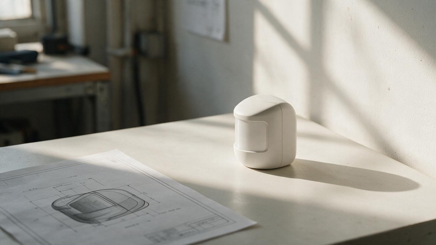
Table of contents
Keep the product white—and keep its shape readable
A white product on a white background should look clean, not unfinished. Yet an AI render can merge a housing into its backdrop, erase a subtle seam, or turn a matte surface gray just to make the outline visible. The better solution is to preserve the approved design and create separation through lighting, background tone, and camera angle.
The prompts below use a compact, screen-free countertop sensor as an example. Substitute your own product and attach an approved CAD view, sketch, or render whenever you have one. Seedream 4.5 is a suitable model to test for this reference-guided image task; judge every result against your source rather than assuming a polished image is an accurate one.
Give the model a design reference, not just a color description
Before using an ai image generator, prepare a source image that shows the silhouette and important features clearly. A neutral three-quarter view is useful for a presentation render; a straight-on view is better if the position of a button, grille, or parting line must be checked precisely.
Write a short constraint list beside the image. For the example sensor, it might read:
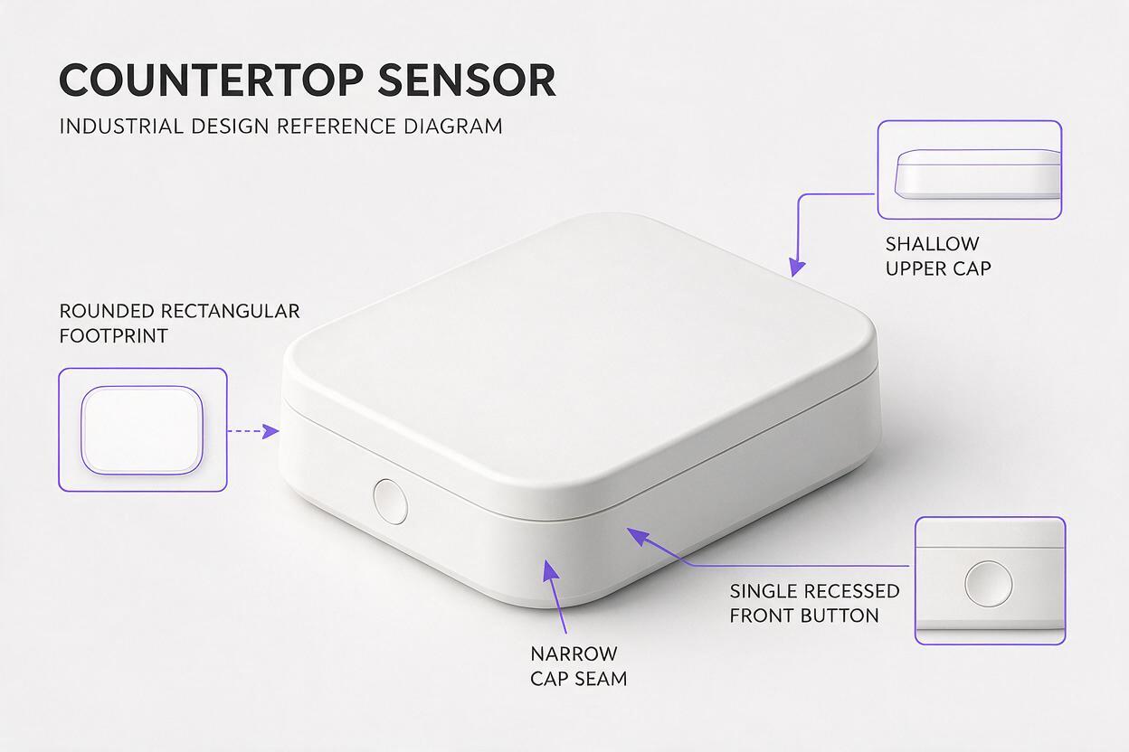
- Keep: rounded rectangular footprint, shallow upper cap, single recessed front button, and narrow seam beneath the cap.
- Finish: matte off-white polymer housing; no metallic trim or glossy coating.
- Do not add: screen, logo, ports, perforations, handles, or accessories.
Specify which visible details are intentional. Without that information, a generation may make an edge easier to see by inventing a bevel or dark gasket that was never in the design.
Prompt for a clean catalog view
For a catalog-style image, ask for a backdrop that reads as white but is fractionally different in tone from the housing. Broad, soft lighting can reveal the product’s curvature without drawing a heavy outline around it.
Use the attached approved product reference as the design source. Create a realistic three-quarter catalog render of this compact countertop sensor. Preserve its exact silhouette, upper-cap height, front-button location, and seam position. Keep the housing matte off-white polymer with believable, subtle surface shading. Place it against a near-white neutral backdrop, slightly distinct from the product in tone. Use a large soft key light and gentle fill so the left and right contours remain visible. Keep the camera near product height with moderate perspective. Do not add features, change proportions, darken the housing to gray, or draw an artificial outline.The phrase near-white neutral backdrop gives the model a way to separate product and setting without recoloring the product. Compare the result with the reference at thumbnail size and at full size: the outer silhouette should read quickly, while the button and cap seam should remain in their approved positions.
Prompt for an editorial image with more depth
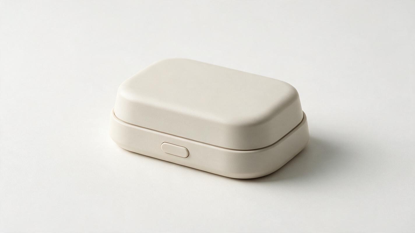
If the catalog view still looks flat, change the environment before increasing contrast on the product. A pale warm-gray setting and a controlled side light can create depth while retaining a predominantly white presentation.
Using the attached approved product reference, create an editorial product image of the same countertop sensor on a pale warm-gray tabletop against an off-white wall. Preserve the product's geometry, matte off-white finish, single recessed front button, and narrow cap seam exactly as shown. Light it with a broad window-like source from camera left and restrained fill from camera right. Make the front face, side face, and upper cap distinguishable through natural tonal gradients, not dark edge strokes. Keep the scene sparse. Do not introduce packaging, text, extra controls, new openings, or a different product shape.This version is useful when stakeholders need to understand volume rather than inspect a pure-white listing image. The background should support the form, not supply a fictional use setting or imply a function the concept has not established.
Prompt for a detail crop that proves the seam is real
A full-product image can hide whether the model retained a small feature or merely suggested one. Generate a closer view when a design review depends on the cap junction, button recess, or surface transition.
Create a close product-detail image using the attached approved reference. Show the front upper corner of the same matte off-white countertop sensor, including the original shallow cap, its narrow seam, and part of the recessed front button. Match their locations and proportions to the reference. Use soft raking light across the surface so the seam reads through a small change in light and depth. Keep the polymer finish matte and the background near-white. Do not enlarge the seam, add a gasket, sharpen the corner, invent fasteners, or introduce printed labels.A detail crop is a presentation aid, not evidence of a manufacturable joint. If the seam must communicate an engineering decision, compare it with the CAD model or drawing before including the crop in a review deck.
Choose the image that explains the design, not the brightest image
| What you see | Likely problem | Prompt adjustment |
|---|---|---|
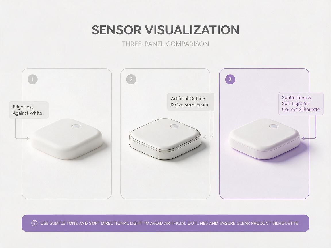
| The outer edge vanishes | Product and background have nearly identical values | Request a slightly different near-white backdrop and broad side-to-side light gradient. |
| The housing looks gray | Contrast was added to the object instead of the scene | Reassert the matte off-white finish; shift the backdrop or fill light instead. |
| A seam becomes a black stripe | The model exaggerates detail for legibility | Request a narrow, subtle junction visible through raking light, with no dark gasket. |
| The shape reads well, but features move | Presentation quality is masking design drift | Return to the reference and explicitly lock each feature’s position. |
For a fair comparison, keep the same reference and product constraints while changing only the lighting or background direction. Inspect candidates beside the source image. Reject any render that improves readability by altering the silhouette, seam geometry, or control layout.
Useful distinction: A readable edge is created by believable light and tonal separation. A new bevel, black stroke, or added trim piece is a design change.
When you have a stable reference, test this prompt yourself with one presentation direction at a time. Save the source alongside each selected render so reviewers can distinguish the approved design from the AI-generated setting and lighting.
Final checklist
- Does the white housing remain white rather than turning gray?
- Can you read the silhouette without an artificial outline?
- Are seams, buttons, and other approved features in their original locations?
- Does the lighting reveal form without inventing bevels or trim?
- Is the image labeled as a concept render when shown outside the design team?
Keywords
white product render, white on white product photography, ai product rendering, product visualization, product design prompts, seedream 4.5